Skip to content

Bread Financial

Bread Financial

Simplifying a complex payment experience into something clearer, faster, and easier to act on.

Bread Financial wanted to create a new mobile payment experience in a crowded fintech market. I helped shape the UX direction, research, and design strategy for a native iOS experience focused on reducing complexity, improving financial clarity, and making everyday payment decisions feel more intuitive.

App Store
4.8
Google Play
4.7

Ratings for the app itself — a net new application, not an update to an existing one.

Client
Bread Financial
Timeframe
8 weeks
Role
Associate UX Creative Director · Researcher · Designer
Team
Creative VP · Visual Designers · Project Manager · Product Manager
Platform
Native iOS
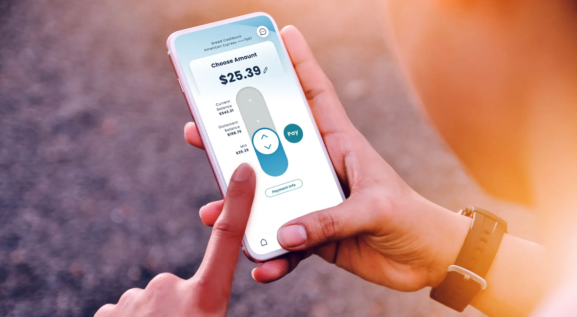
Hands holding a phone showing the Bread Cashback American Express app with a Choose Amount payment screen, a slider control, and a teal Pay button

01

The Challenge

In a saturated fintech landscape, the opportunity was not to add more features — it was to remove complexity and make the core payment experience easier to understand and act on.

Customer

People needed a clearer way to understand what they owed, what they could pay, and how to avoid late fees or interest.

Business

Bread Financial wanted to improve engagement while reducing service friction and support volume.

Experience

The existing payment process risked becoming too transactional and complex, especially when users were already dealing with financial stress.

02

My Role

I worked across strategy, research, facilitation, and design — helping the team simplify the experience while staying grounded in customer behavior and business goals.

I led

  • UX direction
  • Experience strategy
  • Research direction and synthesis
  • Prioritization around core payment needs
  • Cross-functional alignment

I facilitated

  • Stakeholder conversations
  • Comparative and competitive analysis reviews
  • Design critiques
  • Research readouts
  • Product and design decision-making

I did

  • UX concepts
  • Payment flows
  • Prototype exploration
  • Detailed interaction design
  • Research synthesis
  • Usability testing support

My role was not limited to directing the work. I also worked directly in the experience — especially where hands-on design or prototyping helped the team move faster and make better decisions.

03

The Shift

  1. Step 1: We started with

    A traditional payment experience focused on completing a transaction.

  2. Step 2: We realized

    Customers needed more clarity and confidence around payment amounts, timing, fees, and funding sources.

  3. Step 3: We shifted toward

    A simpler mobile experience that made payment decisions more visual, understandable, and actionable.

04

What I Changed

The experience came to life through three major moves.

01

Simplified the payment decision

Paying a bill is one of the most common financial tasks, but the experience can become stressful when users are unsure about minimums, balances, timing, or late-fee implications.

  • Made the minimum payment easier to understand
  • Reduced steps in payment-source setup
  • Surfaced cutoff timing and payment expectations more clearly

My role

Helped define the interaction model and shaped the UX direction for the payment flow.
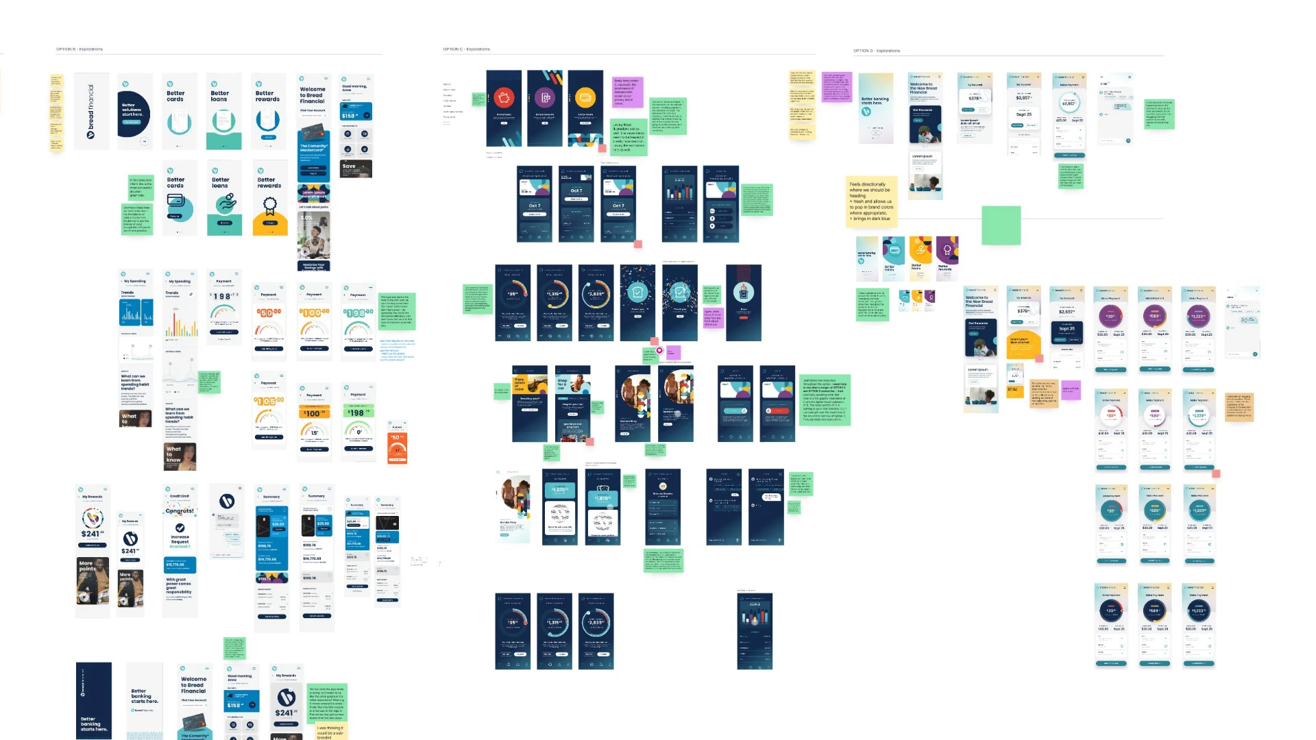
Exploration of multiple Bread Financial mobile app design directions, including payment interfaces, dashboards, rewards, and interaction concepts.

02

Made the experience more visual and intuitive

The native mobile experience gave us an opportunity to move beyond form-based payment interactions and introduce a more direct, tactile way to choose an amount.

We explored a branded slider interaction that allowed customers to adjust payment amounts visually while preserving precise entry when needed.

My role

Worked directly in the interaction design and helped guide how the visual model translated into usable behavior.

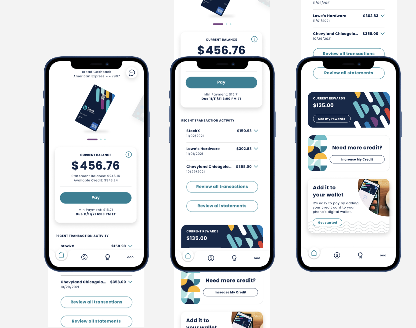
Three iPhone mockups of the Bread Cashback American Express app: the home screen with current balance, statement balance, Pay button and recent transaction activity; a taller view of the same home screen with review actions; and the rewards screen with current rewards, need-more-credit and add-it-to-your-wallet cards.

The video shows the Bread Cashback American Express home screen: the account card moves through a carousel above the statement balance, the Pay button, and recent transaction activity.

03

Connected simplicity with trust

In financial experiences, simplicity only works when users still feel informed and in control.

  • Clarified payment information
  • Supported secure payment-source connection
  • Added confirmation and status feedback
  • Reduced ambiguity around timing and payment outcomes

My role

Helped balance visual simplicity with clarity, trust, and actionable information.

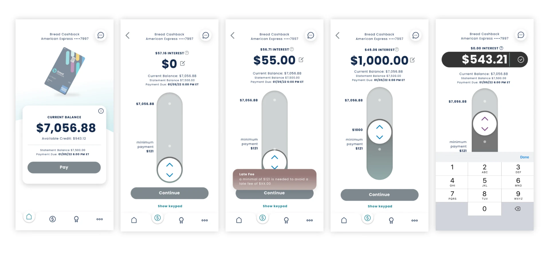
Five Bread Financial payment flow screens in sequence: account overview with current balance, the payment slider at zero, a late-fee warning when the amount is below the minimum, a custom amount chosen on the slider, and precise entry using the numeric keypad.

The video shows a finger dragging the payment slider upward. The amount rises from the minimum to the statement balance and then the full balance, while the slider color shifts and the Pay button follows.

05

How Research Shaped the Experience

Research helped us validate which interaction patterns felt intuitive, where users needed more clarity, and how much flexibility the experience should provide.

Visual communication

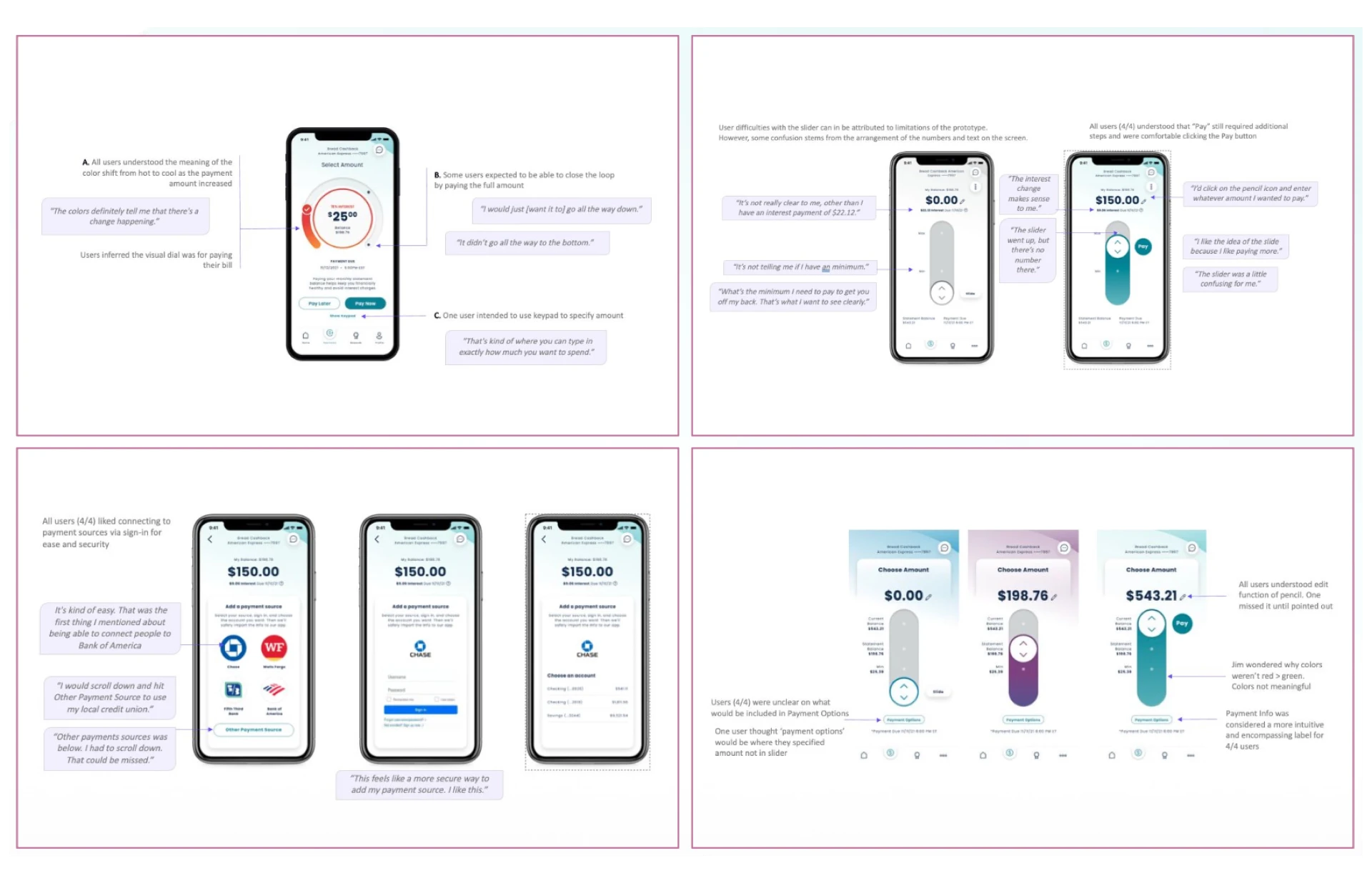
Users correctly understood the “hot to cool” color shift as an indicator of increasing payment amount.

User expectations

Some users expected to pay the full balance by moving the slider to the end, while others wanted precise keypad entry.

Security and ease of use

Users valued securely connecting payment sources through direct sign-in rather than manual entry.

Clarity requirements

The minimum payment amount needed to be more prominent to help customers avoid late fees.

What changed because of research

  • Preserved both slider and precise-entry behavior
  • Improved labeling and navigation
  • Made minimum-payment information more prominent
  • Refined payment-source connection and feedback states

My role

Directed the research framing, helped synthesize findings, and worked with the team to translate them into design changes.

Research synthesis board with four panels of usability testing findings: a circular payment amount dial, a payment slider prototype, a payment-source connection flow, and payment amount states, each annotated with participant quotes and recommendations.

06

What Changed

Customer impact

A clearer and more intuitive way to make payment decisions.

Business impact

A simpler experience designed to reduce payment friction and support lower service demand.

Experience impact

A native mobile interaction model that balanced visual simplicity with precision and control.

App Store
4.8
Google Play
4.7

Ratings for the app itself — a net new application, not an update to an existing one.

07

What Stayed With Me

Financial experiences often happen when customers are already carrying some level of stress or uncertainty.

The project reinforced that simplicity is not about removing information — it is about making the right information easier to see, understand, and act on.

The strongest solutions came from balancing business goals with user behavior, accessibility, research, and systems thinking rather than treating payment as a single isolated interaction.